Stretch Creative | Website

A Redesign for More Engagement and Brand Refinement

In the process of revitalizing www.stretchcreative.co, we encountered several critical challenges. The existing website, while bearing the essence of the brand, was struggling to effectively guide users to content and facilitate a seamless reading experience. The need for a fresh, modern design to refresh the brand was clear, but it also had to be coupled with improvements in user navigation and content accessibility. Our primary challenge was to harmoniously merge the essence of Stretch Creative's brand with enhanced functionality, providing users with a more engaging and efficient browsing experience.

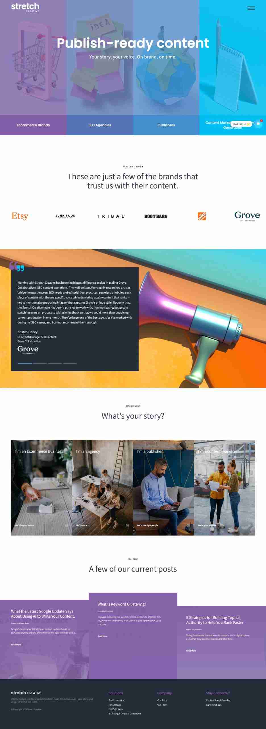
Revitalization Challenges While Balancing Brand Essence and Functionality

Visit Website

Strategic Goal:

Our strategic goals for this project revolved around optimizing the flow of information and directing users towards the desired action of contacting and scheduling consultations. To achieve this, we aimed to enhance the website's overall usability, making content more accessible and appealing. Through a cohesive blend of visual aesthetics and functional design, we sought to reinforce the brand's image and create an environment that intuitively guided users towards their goals.

Objectives:

  1. Enhance the website's navigation structure to provide a more straightforward and logical user journey.
  2. Implement a fresh, contemporary design that resonates with the brand's identity.
  3. Incorporate industry best practices for website design and content presentation.
  4. Prioritize readability and accessibility by reimagining typography and layout.
  5. Restructure the user flow to guide visitors seamlessly toward the desired actions.
Stretch Creative
© 2024 Arbutus Digital Inc.